Happy Valley, OR Branding
I rebranded Happy Valley's logo back in 2013 when I was finishing up being a Graphic Designer at The Art Institute of Portland.
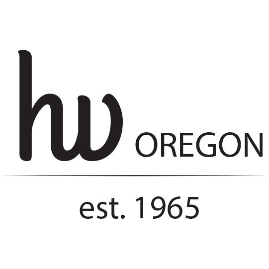
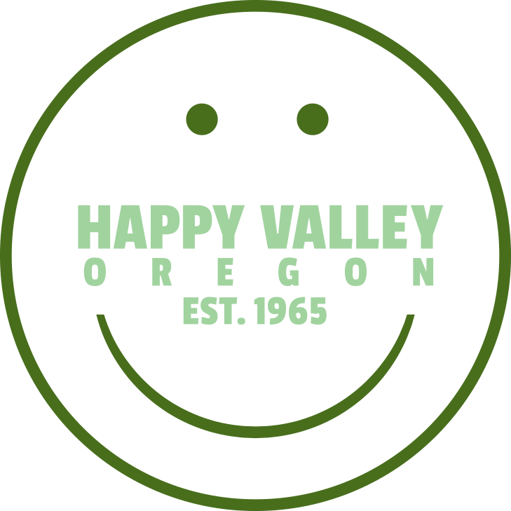
Past logo
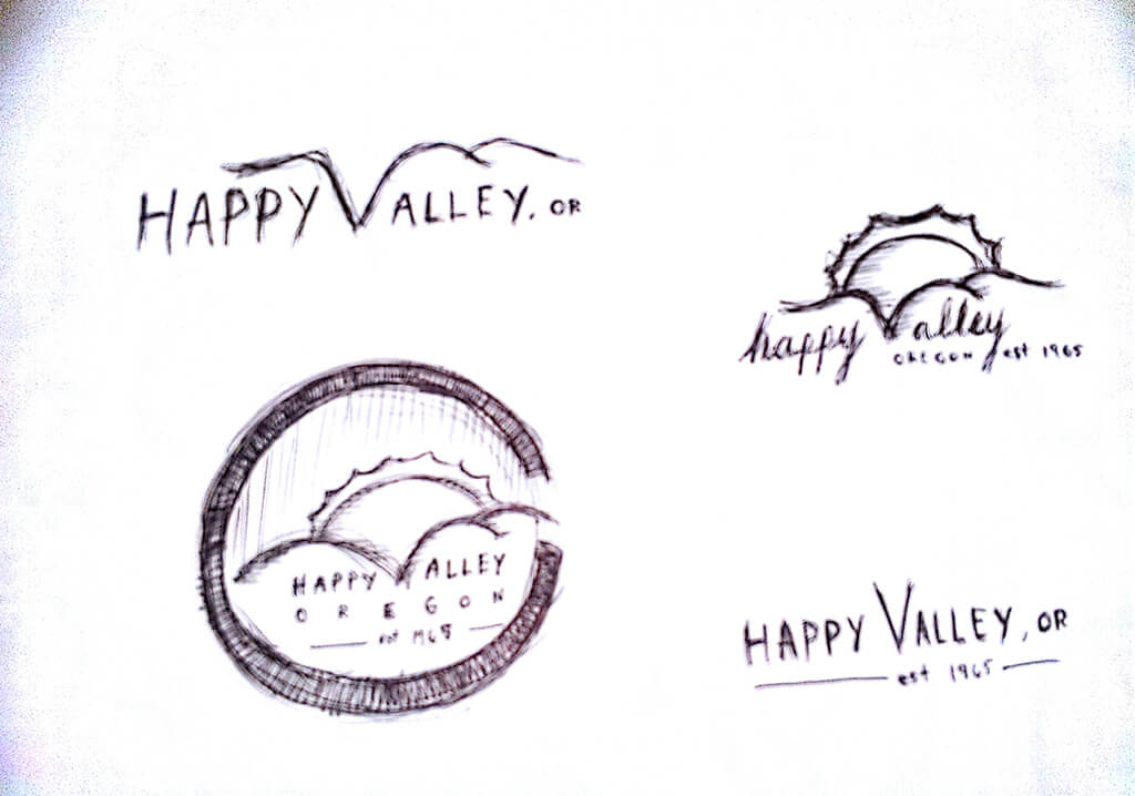
Sketch page 1
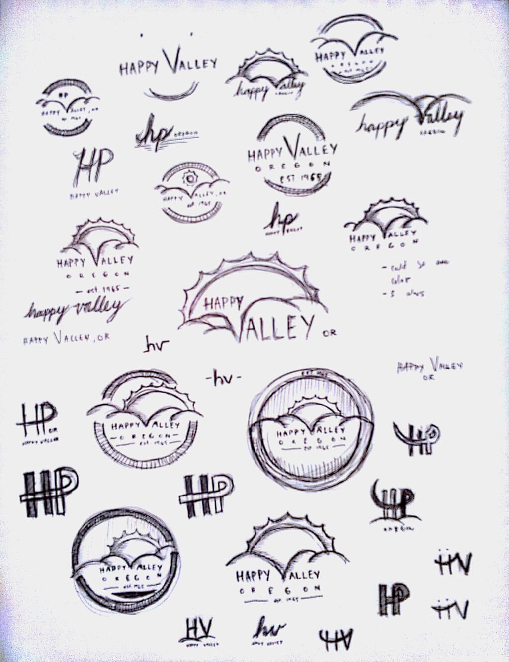
Sketch page 2
I sent over to the city of Happy Valley these two pages of sketches for ideas for their new logo.
I did go on a tangent of "HP", not sure why, but for some random reason I was designing HP until I realized that its Happy Valley, not Happy Palley.
I did go on a tangent of "HP", not sure why, but for some random reason I was designing HP until I realized that its Happy Valley, not Happy Palley.
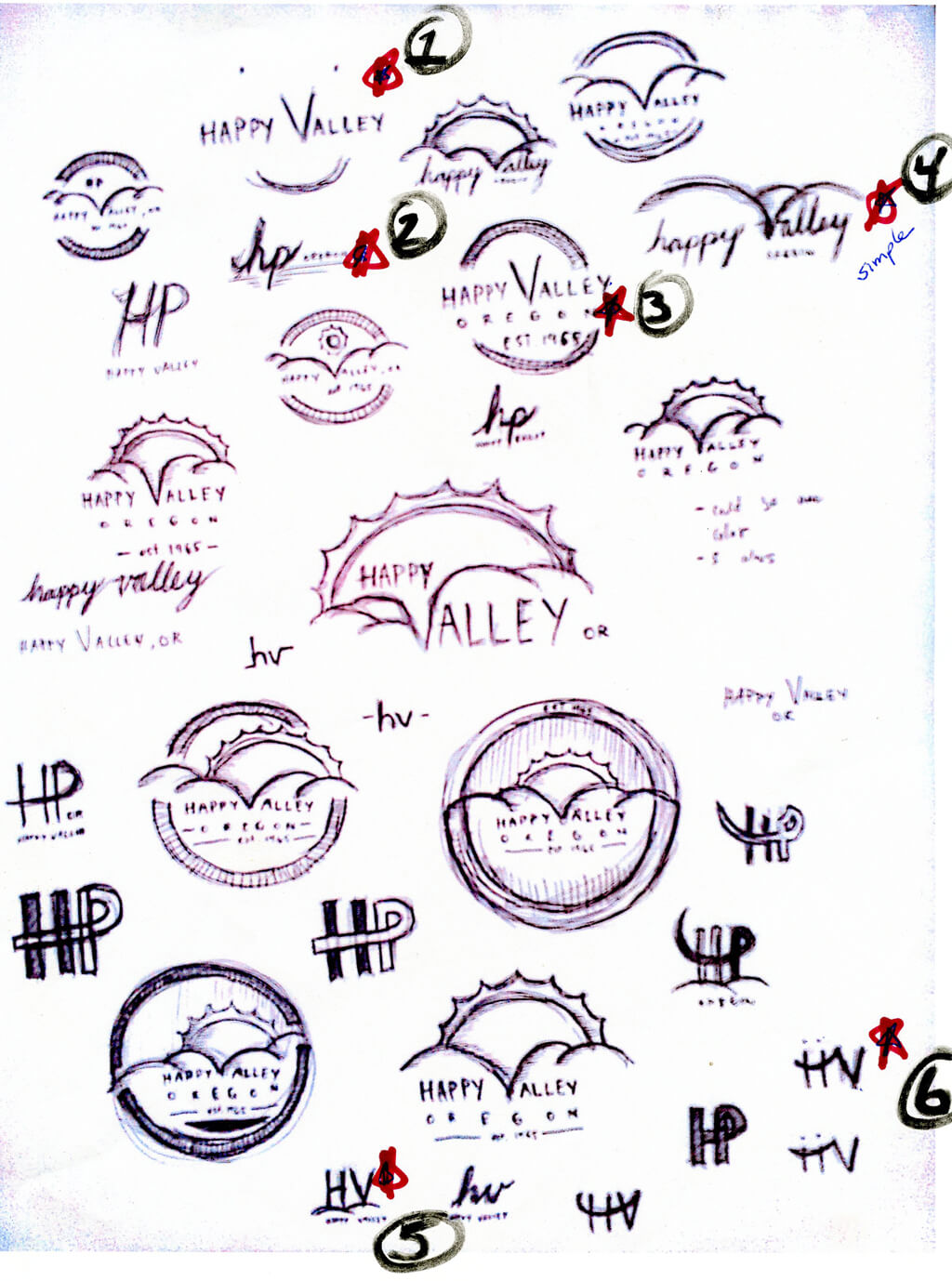
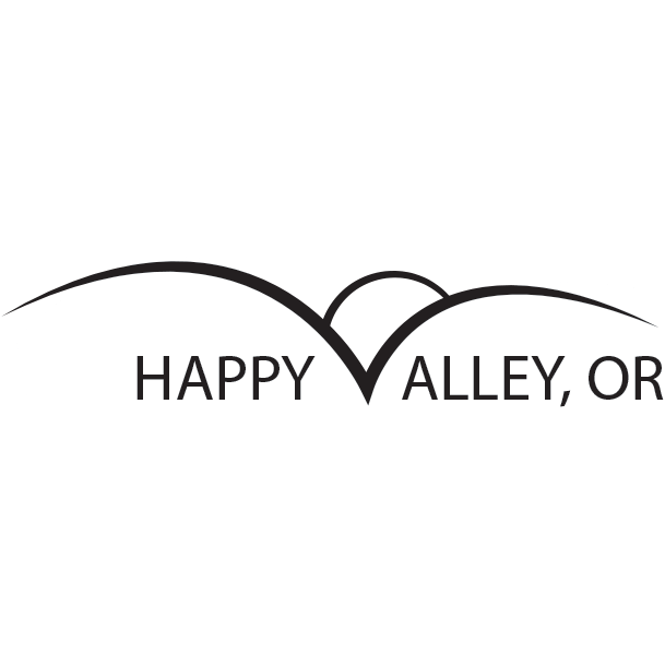
These were the six ideas they liked
Idea 1
Idea 2
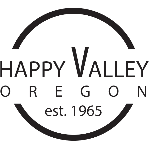
Idea 3
Idea 4
Idea 5
Idea 6
I sent over to Happy Valley these six ideas to choose from.
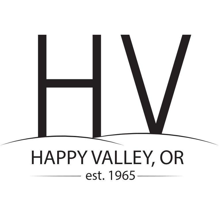
Idea 1
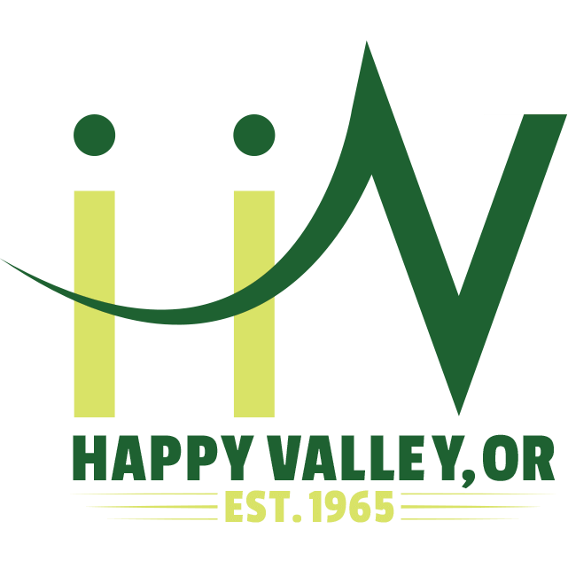
Idea 6
And these were the finalists.
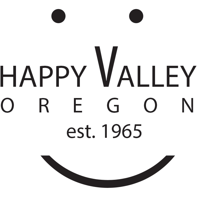
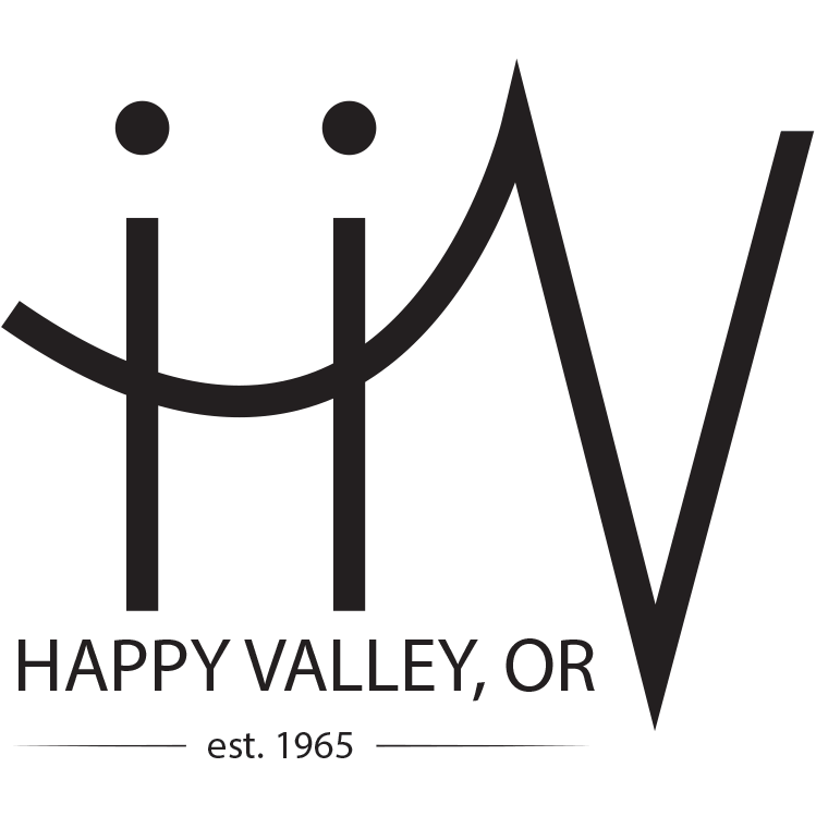
The day before I was supposed to send over the files to Happy Valley, they told me that the "H" with the two dots above looked like "ii", meaning "iiv" or seven. So I removed them and now the "H" looks more like an "H".
One of my coworkers told me it looks like the "H" is high-fiving the "V".
One of my coworkers told me it looks like the "H" is high-fiving the "V".